
Understanding Size Ratios and Scale
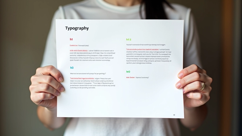
The foundation of good hierarchy is a consistent size scale. Rather than picking random sizes, you’re building a mathematical relationship between your headings, subheadings, and body text. This creates rhythm and makes the layout feel intentional.
A popular approach uses the 1.5x scale: if your body text is 16px, your first-level heading becomes 40px (16 2.5), your h2 is 28px (16 1.75), and your h3 sits at 20px (16 1.25). But here’s the thing — with bilingual content, you’re often dealing with different x-heights between Latin and CJK scripts. Chinese characters naturally feel larger at the same point size, so you might bump up the base body size to 17px or 18px to balance readability across both scripts.
For Hong Kong users on mobile devices with high pixel densities, responsive scaling isn’t optional — it’s essential. A heading that’s readable on desktop might feel cramped on a phone, or conversely, oversized and wasteful of space.

Weight Systems for Visual Distinction
Weight is your second tool for building hierarchy, and it’s just as important as size. Don’t rely on size alone — that’s a mistake we see often. Combining size with weight creates stronger visual distinction and helps readers scan content faster.
A solid system uses three weights: regular (400), semibold (600), and bold (700). Your h1 might be bold and larger. Your h2 uses semibold at a medium size. Body text stays at regular weight. This isn’t arbitrary — you’re training readers to recognize patterns. When they see bold text, they know it’s important. When they see regular weight, they know it’s supporting information.
Here’s where bilingual design gets tricky. Not all fonts support the same weight range across Latin and CJK. Google Noto Sans, which we mentioned before, gives you consistent weights from light to black in both scripts. But some fonts have gaps. You might find a beautiful Chinese font with only regular and bold, which limits your hierarchy options. That’s why planning your font system early matters so much.
Line Height and Letter Spacing Impact
Hierarchy isn’t just about the letterforms themselves — the space around them matters enormously. Line height and letter spacing affect readability, visual weight, and how much importance text appears to have on the page.
Headings typically use tighter line height: 1.1 or 1.2. This makes them feel more compact and important. Body text needs more breathing room — 1.5 or 1.6 for comfortable reading. This spacing difference reinforces the visual hierarchy. The tighter heading draws the eye. The looser body text invites reading.
Letter spacing also plays a role. Headlines in Chinese often use tighter tracking (negative letter spacing) to feel more cohesive, while Latin text sometimes benefits from slight positive tracking for clarity at smaller sizes. It’s a subtle adjustment, but it makes a difference on those high-density Hong Kong displays where every pixel counts.

Practical Implementation for Hong Kong Audiences
Let’s get concrete. You’re building a website for a Hong Kong fintech startup with content in English and Traditional Chinese. Your heading hierarchy needs to work on everything from a 5-inch phone screen to a 27-inch desktop monitor. You’re also dealing with users who expect responsive text that adapts intelligently.
Start with your h1. At desktop, it’s 40px bold. On mobile, it scales down to 28px using clamp(). The relationship stays consistent. Your h2 goes from 28px desktop to 20px mobile. Body text ranges from 17px to 16px — a subtle shift that accounts for the smaller viewing distance on phones. The weight system remains the same across all screen sizes: bold for h1, semibold for h2, regular for body.
Color adds another layer. You might use your primary brand color for h1, a slightly muted version for h2, and the standard text color for body. This creates a visual progression that reinforces importance. Don’t go crazy with colors though — consistency matters more than variety.
Common Mistakes to Avoid
We’ve seen plenty of hierarchy systems that look good on desktop but fall apart on mobile. The most common issue? Ignoring the bilingual aspect entirely. Designers set up hierarchy for English text, then apply the exact same system to Chinese. It doesn’t work because the scripts have different visual weight at the same point size.
Another mistake: relying solely on size. If your h2 is just slightly larger than body text, readers won’t scan the hierarchy effectively. You need size plus weight, or size plus color, or ideally all three working together. It’s the combination that creates real visual distinction.
Finally, don’t skip the testing phase. What looks perfect on your design tool might feel cramped on an actual phone. Hong Kong’s high-density displays mean that typography at 16px on your 27-inch monitor looks different at 16px on a user’s phone. That’s not a problem if you’ve planned for it with responsive scaling and proper line heights.