Why Web-Safe Fonts Matter for Bilingual Sites
Building websites for Hong Kong audiences means navigating a unique typography challenge. You’re working with two completely different writing systems—Latin characters for English and complex Han characters for Chinese. The trouble is, most computers don’t have the same fonts installed, so you can’t just assume your carefully chosen typeface will display correctly.
Web-safe fonts solve this problem by limiting your choices to typefaces that ship with every operating system. It sounds restrictive, but it’s actually liberating. You get guaranteed consistency across Windows, macOS, iOS, and Android devices. No surprises when users view your site on their phones or older computers.
For bilingual sites, the stakes are higher. You’re not just picking one font—you’re orchestrating a system where English and Chinese text harmonize visually while maintaining legibility on high-density displays that’re common throughout Hong Kong. Google Noto changes this equation entirely.

Understanding Google Noto Sans and Serif
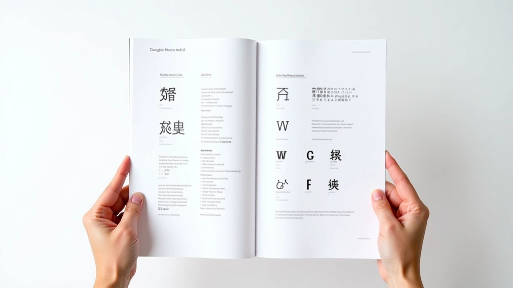
Google Noto isn’t just one font. It’s a massive ecosystem of typefaces designed to cover 1,000+ languages and scripts with visual harmony. The name itself says it all—”Noto” means “no tofu,” referencing those ugly placeholder boxes that appear when a system doesn’t have a font for a character.
For Hong Kong websites, you’re primarily concerned with Noto Sans and Noto Serif. Both come in two flavors: a generic version and a Simplified Chinese variant (Noto Sans SC, Noto Serif SC). The SC versions are optimized for mainland Chinese, but they work perfectly for Hong Kong’s mixed audience since many residents are familiar with both traditional and simplified characters.
What makes Noto special is its comprehensive character support. A single weight and style covers 30,000+ characters. You’re not juggling separate fonts for English, numbers, punctuation, and Chinese—it’s all in one file. This simplifies your font stack considerably and reduces the number of HTTP requests your site makes when loading.
Building Your Font Stack Strategy
A proper font stack is like a fallback ladder. You’re saying: “Use this first choice, but if it’s not available, try this next option, then this one, and so on.” For bilingual Hong Kong sites, your stack should look something like this:
font-family: 'Noto Sans SC', 'Helvetica Neue', Arial, sans-serif;
Here’s what’s happening: First, load Noto Sans SC (from Google Fonts). If that fails, fall back to Helvetica Neue, which ships with every Mac. Then Arial, the Windows standard. Finally, any sans-serif font the browser can find. This strategy ensures your site never renders in Times New Roman (the dreaded default).
The key insight—and this matters for performance—is that you’re naming a single font file that handles both Latin and CJK characters. You’re not specifying separate fonts for English versus Chinese. This is different from older approaches that required language-specific font declarations.
Implementation and Performance Optimization
There’re two ways to deliver Google Noto fonts: via Google Fonts CDN or self-hosted. The CDN is convenient—you just add a link tag and you’re done. But self-hosting gives you better control and often faster delivery for Asian audiences. Hong Kong users might experience latency pulling from Google’s US servers, so hosting the fonts on your own Asia-Pacific infrastructure makes sense.
The real performance killer with Noto is file size. The full Noto Sans SC font is roughly 800KB. That’s substantial. Here’s where subsetting comes in—you extract only the characters your site actually uses. If you’re not displaying Traditional Chinese, don’t load those glyphs. If you don’t need bold italic, exclude that weight.
Tools like FontTools and Glyphhanger let you analyze your HTML and automatically generate subsetted fonts. A properly subsetted Noto Sans SC file can drop to 200-300KB, which is manageable. Combined with variable fonts—which let you get multiple weights from a single file—you’re looking at serious performance gains.

Handling Fallbacks and Font Display

The CSS font-display property controls how browsers handle fonts that haven’t loaded yet. For web-safe scenarios, you’ve got four strategies: swap (show fallback immediately, replace when Noto loads), block (wait up to 3 seconds for Noto, then use fallback), fallback (quick timeout, don’t re-render), or optional (load if available, don’t wait).
Most designers prefer “swap” for critical fonts. Users see readable text immediately—maybe it’s Helvetica instead of Noto for a split second—but they’re not staring at a blank screen. Once Noto arrives, the page smoothly transitions to the intended typeface. It’s a better user experience than the alternative (invisible text while waiting).
For body text on bilingual sites, you want this swap behavior. For decorative fonts in headers, you might choose optional—if it doesn’t load quickly, the fallback works fine. The strategy depends on how critical that specific font is to your design.
Bringing It All Together
Web-safe fonts and Google Noto aren’t limitations—they’re solutions. By understanding how to layer fallbacks, optimize file sizes, and leverage Google’s extensive character coverage, you’re building typography systems that work reliably across Hong Kong’s diverse device landscape.
The technical foundation is straightforward: use Noto Sans or Serif SC as your primary font, subset it aggressively, self-host if possible, and set appropriate font-display values. But the real skill is recognizing that web typography is fundamentally different from print. You’re not just picking a pretty font—you’re architecting a system that balances aesthetics, performance, and reliability.
Start with a single Noto variant. Measure your load times. Subset based on actual usage. Iterate. That’s how you build bilingual typography systems that feel effortless to users but are engineered with precision.
Disclaimer: This article provides educational information about web typography practices and font implementation strategies. Font rendering behavior varies across browsers, operating systems, and devices. Test your implementation thoroughly across your target audience’s devices and environments. Font licensing terms change regularly—verify current Google Fonts and Noto licensing before deploying. Performance metrics mentioned are approximate and depend on specific site configurations, network conditions, and user devices.