
Understanding the Challenge
When you’re designing for bilingual audiences in Hong Kong, you’re not just picking two fonts that look nice together. You’re solving a visual puzzle. Latin characters and Chinese characters have completely different structures, proportions, and spacing requirements.
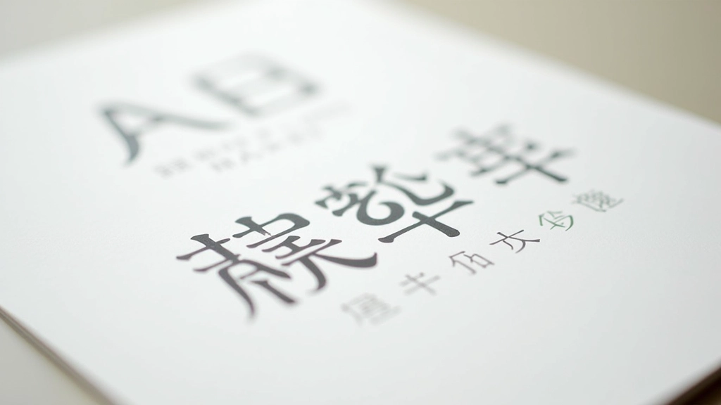
The issue? Most serif fonts designed for English don’t pair naturally with Chinese fonts. A traditional English serif like Garamond feels formal and delicate, but Chinese fonts need more weight and clarity to remain readable at smaller sizes. If you pair them directly, the Chinese text looks heavier and dominates the page — even when they’re technically the same point size.
That’s where optical matching comes in. You’re not matching point sizes. You’re matching visual weight.

Weight Matching: The Foundation
Start here. If you’re using a 400-weight English sans-serif, don’t automatically pair it with a 400-weight Chinese font. Instead, look at the actual visual appearance. A 400-weight Chinese sans-serif from Google Noto often looks heavier than a 400-weight Latin font because Chinese characters are more complex — they have more strokes and less white space inside them.
The practical solution? Step down. If you’re using a 400-weight English font, try a 300 or 350-weight Chinese font. Does it feel balanced now? Good. That’s your match. In Hong Kong, we see this pattern consistently: English text at 400-500 weight works best with Chinese text at 300-400 weight.
Test this on actual body copy, not just headlines. A single headline might look balanced, but paragraphs reveal the truth.
Optical Sizing and x-Height
Here’s something most designers miss: x-height. It’s the height of lowercase letters like ‘x’ and ‘a’ in Latin fonts. A font with a large x-height feels bigger at the same point size. Chinese characters don’t have an x-height (they don’t have case), but they do have an equivalent visual size.
Google Noto Sans SC is designed with a fairly large x-height, which is why it works well for screen reading. If you pair it with an English font that has a small x-height, the English text will feel cramped and undersized. Your readers will unconsciously struggle.
Pro tip: When choosing an English font for Hong Kong audiences, prioritize fonts with generous x-heights. Inter, Open Sans, and Source Sans Pro all work because they’re designed for screen legibility — which is what you need when pairing with Chinese fonts optimized for the same purpose.

Building Your Pairing System
Here’s what actually works for Hong Kong websites. Most successful sites use a three-tier system:
- Headings: A bolder English font paired with a heavier Chinese font. Think 600-700 weight for both.
- Body text: A regular English font (400 weight) paired with a lighter Chinese font (300-350 weight).
- Captions: Lighter English font (300 weight) paired with an even lighter Chinese option (250-300 weight).
This creates a visual hierarchy that works across both languages. Your readers’ eyes move the same way through Chinese text as they do through English text. That consistency matters more than most designers realize.
Practical Implementation
When you’re actually building the site, here’s the order: Start with body copy. Get that pairing right first. Don’t start with headlines — they’re forgiving. A bold headline looks good almost anywhere. Body copy? That’s where your pairing lives or dies.
Test across devices. Hong Kong users are on high-density displays — iPhones, Android phones, MacBook Pros. What looks balanced on your desktop monitor might feel off on a retina screen. The pixel density changes how fonts render. What looks crisp on a 96 DPI monitor might look blurry on a 326 DPI phone screen if you haven’t optimized your font choices.
Google Noto Sans SC remains the safest bet for body copy. It’s web-safe, it’s designed for screen display, and it pairs naturally with almost any modern sans-serif. If you want something different, look at Alibaba’s Source Han Sans or the newly released variable fonts from Monotype. But test first. Always.

Getting It Right
Pairing Latin and CJK characters isn’t about finding fonts that look “nice together” on paper. It’s about understanding that these two writing systems have different visual languages. Chinese characters are denser, more complex, and require different spacing and weight treatments than English letters.
The best pairings feel invisible to readers — they don’t notice the typography, they just read smoothly. That’s your goal. When a Hong Kong reader moves from an English headline to a Chinese subheading, the transition should feel natural. The visual weight shouldn’t jump. The line height shouldn’t feel cramped on one side and loose on the other.
Start with weight matching. Move to optical sizing. Test on real devices. Then trust your eye. You’ll develop an instinct for what works, and you’ll stop settling for pairings that just barely work.
About This Article
This article is educational information about typography principles and font pairing practices. The recommendations reflect common practices observed in professional design for bilingual English-Chinese websites. Your specific design needs may vary based on your target audience, brand guidelines, and technical requirements. Always test font pairings in your actual design context before implementation. Font rendering can vary across browsers, operating systems, and devices.