Mastering Bilingual Typography in Hong Kong
TypoSync Limited helps designers and developers create harmonious typographic systems that blend English and Chinese seamlessly. We’re specialists in font pairing, readability optimization, and establishing visual hierarchy across mixed-language content.

What We Specialize In
Since 2019, we’ve worked with over 150 brands across Hong Kong, Singapore, and Taiwan. Our expertise covers every aspect of bilingual typography—from font selection to pixel-perfect spacing on high-density displays.
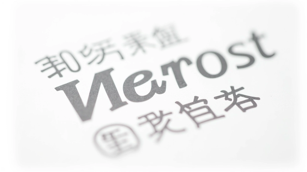
Font Pairing Expertise
We pair Latin typefaces with CJK character sets that harmonize visually. Our process considers stroke weight, x-height, and optical balance across character sets.
Spacing & Rhythm
Managing line height and letter spacing across mixed-language content requires precision. We establish consistent paragraph rhythm that works in both languages.
High-Density Optimization
Hong Kong users expect crisp rendering on retina displays. We optimize font rendering for Retina and higher-density screens without compromising performance.
Web Font Implementation
Google Noto fonts, web-safe alternatives, and self-hosted solutions—we implement the right approach for your project. Performance and reliability are non-negotiable.
How We Build Typographic Systems
We don’t believe in one-size-fits-all solutions. Every project gets a tailored approach that respects both languages and the users who read them.
Analyze Your Content
We examine how much English versus Chinese content you’ll display. The ratio affects font selection, sizing, and spacing decisions. Not all typefaces work equally well in both languages.
Select Font Pairs
We test combinations—often pairing geometric sans-serifs for English with clean Chinese typefaces. We’re looking for visual harmony, not just legibility. The pair needs to feel intentional.
Establish Hierarchy
Typographic hierarchy—headings, body text, captions—needs clear visual distinction. We use size, weight, and color thoughtfully. Hierarchy in bilingual text is trickier than monolingual design.
Optimize Spacing
Line height and letter spacing vary between languages. We fine-tune these metrics for readability and visual balance. Every pixel counts on high-density displays.
Test & Refine
We test on actual devices—phones, tablets, desktops. We check rendering on various browsers and OS platforms. We iterate until the typography feels right.
Google Noto & Web-Safe Solutions
We’ve moved beyond system fonts. Today, we use Google Noto fonts extensively because they’re free, regularly updated, and support thousands of characters across CJK sets. But we also understand when hosted fonts make sense versus web-safe fallbacks.
Google Noto Serif SC and Noto Sans SC for comprehensive Chinese support with excellent rendering
Fallback hierarchies that prevent layout shift and maintain readability during font load
Variable fonts where available to reduce file size without sacrificing quality
Performance monitoring—we track font load times and optimize critical rendering paths
Typography as Communication
“Typography isn’t decoration. It’s how your message gets read. When you’re speaking to bilingual audiences, you’re really speaking to multiple cultures. The typeface is part of that conversation.”
Our Core Values
Clarity First
Every decision we make serves readability. Beautiful type that’s hard to read isn’t beautiful—it’s broken.
Cultural Balance
We respect both languages equally. Neither English nor Chinese is secondary. They’re partners in the design.
Technical Precision
Pixel-perfect spacing matters. We sweat the details because users notice—even if they can’t articulate why.
Important Information
The information and guidance provided on this website are for educational and informational purposes only. While we strive to offer accurate, current, and relevant insights into typography, font implementation, and bilingual design practices, individual results and application outcomes will vary based on specific project requirements, technical constraints, and implementation approaches. We recommend consulting with qualified design and development professionals for guidance specific to your situation. The typographic principles we discuss are guidelines—not absolute rules—and should be adapted to your particular context, audience, and technical environment.