
Pairing Latin and CJK Characters Effectively
Learn how to select font pairs that harmonise between English and Chinese scripts. Covers weight matching, optical sizing, and visual balance across character sets.
Read MoreMaster font pairing, spacing, and readability across English and Chinese content in Hong Kong
Explore essential guides on bilingual typography and font management
Learn how to select font pairs that harmonise between English and Chinese scripts. Covers weight matching, optical sizing, and visual balance across character sets.
Read More
Practical guidance on setting line height and letter spacing for mixed-language content. Includes specific measurements for readability on Hong Kong displays and best practices.
Read More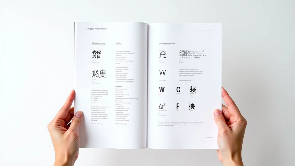
Understand web-safe font options for Hong Kong audiences. Covers Google Noto Sans and Serif, fallback strategies, and performance optimization for bilingual sites.
Read More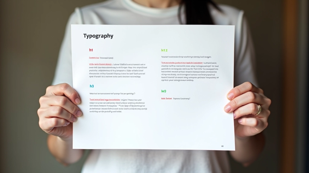
Create visual distinction between headings, body text, and captions in bilingual layouts. Includes size ratios, weight systems, and practical examples for Hong Kong web design.
Read MoreFollow these steps to optimize typography for your bilingual Hong Kong website
Evaluate existing font choices, line heights, and spacing across English and Chinese content. Test readability on high-density displays common in Hong Kong.
Choose complementary Latin and CJK fonts. Consider Google Noto Sans SC or Noto Serif SC for reliable Chinese support with good Latin compatibility.
Establish consistent heading and body size ratios. Ensure visual balance between English and Chinese text at all sizes for optimal hierarchy.
Set line heights between 1.6-1.8 for body text, adjust letter spacing carefully. Test paragraph rhythm across bilingual content blocks.
Essential typography specifications for bilingual English-Chinese websites